EM To PX Converter
em
What is Em to Pixels Converter?
The term “Em” basically refers to the width of the letter “M” in a given typeface. And Px (pixel) stands for “Picture Element.” The Em to Px Converter is a free online tool that you can use to convert em to pixel values.

How to Convert Em to Pixels?
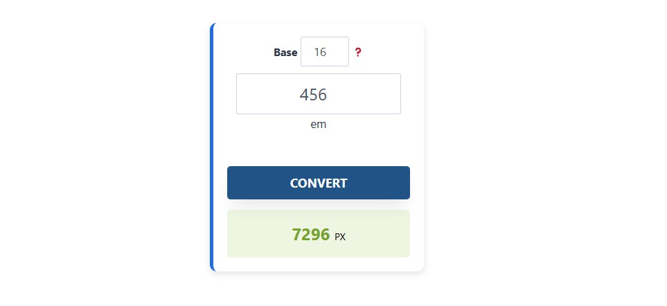
Use our Em to Pixels calculator and follow the steps below:
- Enter the base value in the mentioned column.
- Then, write the em value that you want to convert.
- Press the convert button and get the result instantly in pixels.
Em to Px Formula
If you are confused and want to make sure that the calculator is giving you the correct value, then you can double-cross it with the following formula:
Pixel Value (px) = em Value * Base Font Size (px)(The default font size is 16px)For example, If the base font size is 16px, then,
- 0.8em = 12.8px
- 1em= 16px
- 1.5em= 25px
- 2.5em= 40px
Must try px to em & feet to pixels on our website for free.
Em to Pixels Conversion Table
Here is a brief table in which some em to pixel values are discussed. Most frequently, the base font size is 16px, so the below table is set on this default value to save your time. Moreover, you can also double check the value by using the above tool.
| EM | PX |
|---|---|
| 0.25em | 4px |
| 0.5em | 8px |
| 0.75em | 12px |
| 1em | 16px |
| 1.25em | 20px |
| 1.5em | 24px |
| 2em | 32px |
| 2.5em | 40px |
| 3em | 48px |
| 4em | 64px |
| 5em | 80px |
| 6em | 96px |
| 7em | 112px |
| 8em | 128px |
| 10em | 160px |
| 11em | 176px |
| 12em | 192px |
| 13em | 208px |
| 14em | 224px |
| 15em | 240px |
| 16em | 256px |
| 18em | 288px |
| 20em | 320px |
| 24em | 384px |
| 30em | 480px |
| 32em | 512px |
| 40em | 640px |
| 48em | 768px |
| 60em | 960px |
| 64em | 1024px |
| 80em | 1280px |
| 96em | 1536px |
| 120em | 1920px |
| 125em | 2000px |
Few Examples Of How EM Works
Here are some unique and better examples of how EM works in different scenarios, including nested elements, scaling effects, and practical use cases.
Example 1: Nested Scaling Effect
When an element inherits em values, it multiplies based on its parent’s size.
HTML:
<section>
    <article>
        <p>This is an example of nested EM scaling.</p>
    </article>
</section>
CSS:
section {
    font-size: 16px; /* Base size */
}

article {
    font-size: 1.5em; /* 1.5 times the section size (16px * 1.5 = 24px) */
}

p {
    font-size: 2em; /* 2 times the article size (24px * 2 = 48px) */
}
Result:
<section>= 16px<article>= 24px (16px × 1.5)<p>= 48px (24px × 2)
✅ EM scales dynamically based on its parent, causing exponential growth in nested elements.
Try something different convert pixels to inches or vw to px with full accuracy.
Example 2: Button Scaling for Accessibility
Use em for button padding and font sizes, so it scales proportionally.
HTML:
<button class="btn">Click Me</button>CSS:
.btn {
    font-size: 1.5em; /* 1.5 times the body font size */
    padding: 0.5em 1em; /* Dynamic spacing */
    border: none;
    background: blue;
    color: white;
    cursor: pointer;
}
Why It’s Useful?
- If the user increases the base font size, the button scales proportionally.
- More accessible for users who adjust font sizes for readability.